

The brief requires the student to celebrate the life’s work of Adrian Frutiger. The idea was to create a prestigious ‘publication’ (digital/physical or both) that celebrates the life and work of Adrian Frutiger. I created a publication that was educational yet artistic. This is done by my theme called 170,170 refers to the 170 fonts that Adrian Fruitger created but only a few where published. (Diaz, 2012).


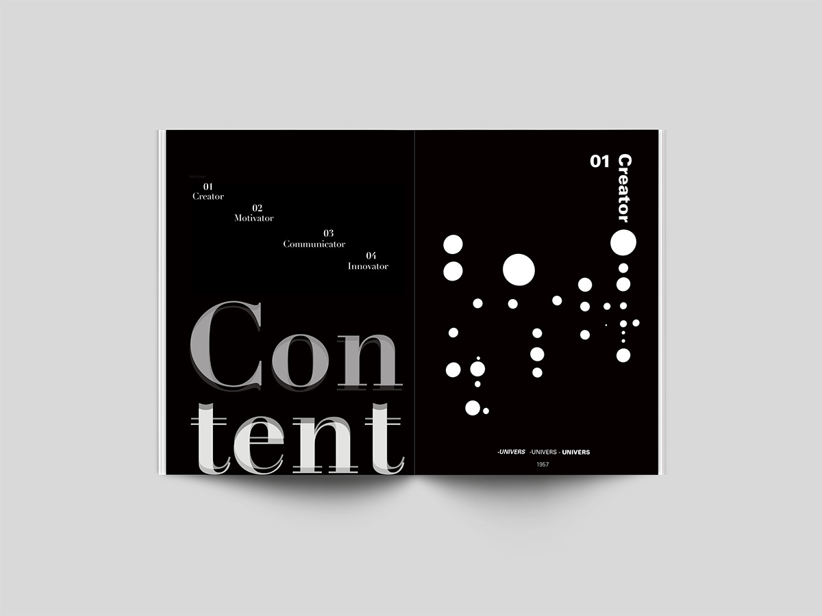
My book is divided into sections called chapters. Each chapter is named after the characteristic of Adrian Frutiger. The first chapter is called Creator, as Adrian Frutiger created many typefaces. Innovator-Adrian was innovative in his designs. Motivator- He motivated other typeface designers. Communicator-His fonts communicated a specific message to the viewer, whether in a newspaper or signage, Adrian Frutigers fonts helped communicate to the viewer.
Another important characteristic of the chapters is that each of the chapter is based on a different font, the font decides on the chronological order in my book. The first chapter is Univers because it was created in 1957,the second chapter is based on Frutiger which was created in 1975, chapter three is Didot which was created in 1977 and lastly chapter four is Avenier because it was created in 1988. The respective fonts are only evident in their respective chapters. Below each heading or typography layout and body copy a little note on the bottom educates the reader about the weight and it also celebrates and shows off the fonts. 
Each chapter begins with a geometric patterns, and typographic patterns. The four chapter beginnings have patterns that represent a variation of different Swiss graphic design styles. The chapter beginnings also serve as a A4 sized poster that a designer can keep to look at the font, and remember.


THANKYOU!


